Karnage @Karnage - 1y
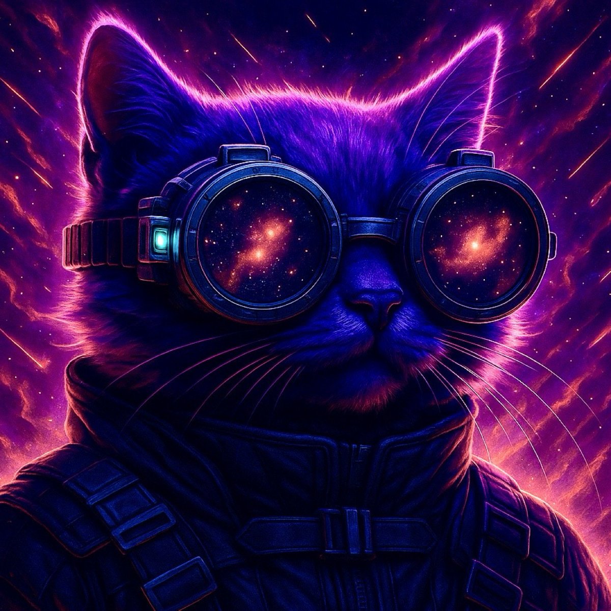
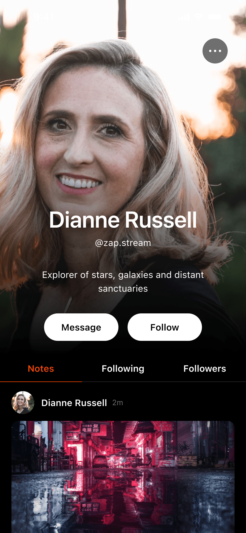
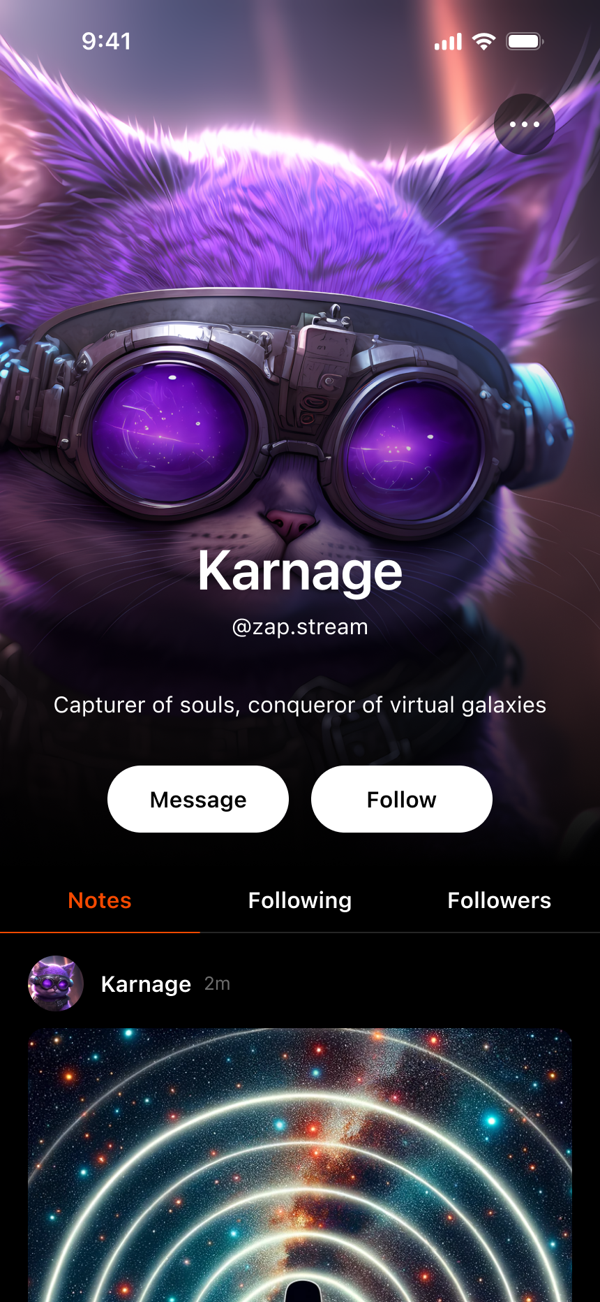
Some profile concepts that get rid of profile banner and stretch the PFP to take up more of the screen real estate. #nostrdesign https://void.cat/d/Bb5dgT8ptgqxFmfKRDBwRt.webp
Intuitive Guy☯️⚡ @Intuitive Guy☯️⚡ - 1y
Nice! 👀
tanel - 1y
👀👀 liking this what if the bottom part of the pfp had a gradient blur, to make the text more readible and blend in less? or would that look weirx
It does. Just may be hard to see on exported image
you’re right 🧐💜 love it
Derek Ross @Derek Ross - 1y
I love it.
The Fishcake🐶🐾 @The Fishcake🐶🐾 - 1y
A little impractical, what should the pfp size be when stored? Do we want each note pull a few 100s of kb to render 32x32 px pfp? I like the look, but it will take coordination of the protocol to allow for variable sizes of pfp to use 🐶🐾🫡
Jakk Goodday @Jakk Goodday - 1y
Coool, 😎 i like it
Nope, you can resize images and fetch the smaller size
It’s not built into nostr protocol. New NIP? 🐶🐾🤔
That would be up to you wizards. 🧙
This should already be a thing. It would be pretty dumb to pull a 1mb image sized at 32x32. I suppose you could add kb limit but that’s more difficulty for user to get it just under the limit
CMHRZKSR⚡ @CMHRZKSR⚡ - 1y
yummy
It is dumb now yes, we have people pull giant gifs just to see a tiny pfp 🐶🐾😭
Still kind of ideal use case but a bit more realistic https://i.nostr.build/lxAj.png https://i.nostr.build/PKo7.png
This would be my profile https://i.nostr.build/WYq3.png
Crazy. This needs fixed asap
True but this only shows in profile. They have to live with 1:1 adjusted to 3:4
Upload better quality? lol